QUIKSILVER
Digital Design System

The Challenge
Quiksilver’s digital presence was inconsistent and inefficient. The website homepage was a scattered mix of campaigns and collections, each with different colors and styling, creating an overwhelming and disjointed brand story. Meanwhile, email marketing relied on one-off, image-only designs that took designers up to two days to produce, with little return on investment. With multiple designers working in silos, each email felt like it came from a different brand.
Execution
The goal was to establish a standardized set of tools and processes that could be used across all regions to ensure brand consistency and gain efficiencies. I developed a unified digital design system that spanned across both the website and email marketing. This system streamlined color palettes, typography, and layouts while introducing reusable HTML templates for email. The framework allowed designers to work more efficiently, eliminated redundant efforts, and ensured that every digital touchpoint reflected Quiksilver’s global brand story with clarity and cohesion.
The Result
The system delivered a 78% improvement in efficiency and a 68% increase in revenue, while creating a globally unified brand vision and user experience. Emails became faster to produce, more effective in performance, and consistently on-brand, while the website homepage transformed into a cohesive and engaging experience. Together, these changes improved customer trust and loyalty across all regions, strengthening Quiksilver’s position as a leader in surf culture worldwide.
DESIGN SYSTEM
At-a-glance

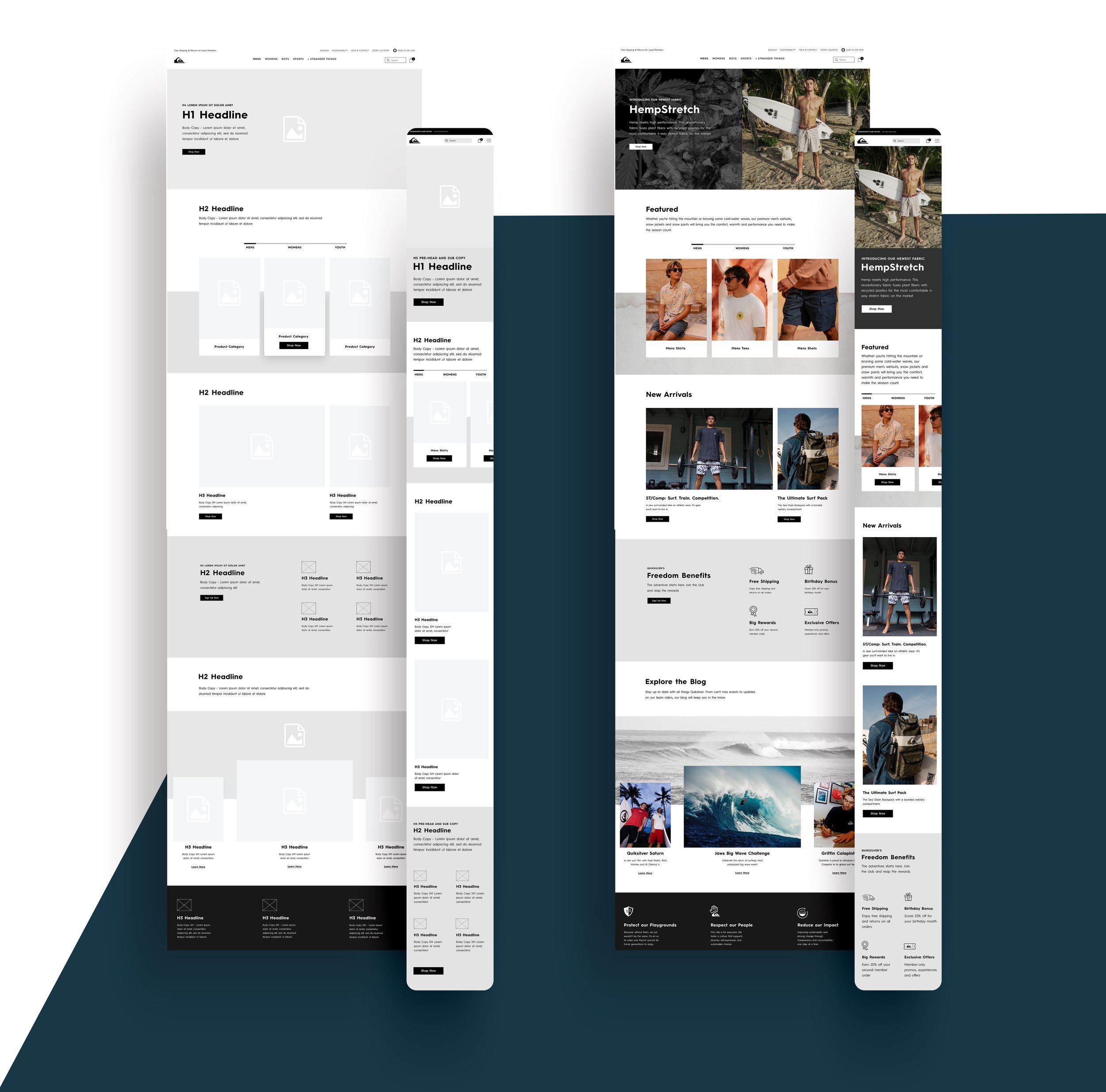
WEBSITE
Wireframe & Design
EMAIL DESIGN SYSTEM
At-a-glance

Let’s talk numbers
We all know data is king, so we took a look at the numbers and the results were staggering.
63%
Increase in Revenue
54%
Increase in Click Rate

EMAIL DESIGN
The system in action

My Role:
Strategy
Creative Direction
UI/UX
My Role:
Design
Creative Execution
