ONEHOPE WINE
Brand Refresh


The Process
(In a nutshell)
The Challenge
ONEHOPE was split between two very different brand identities: the Winery, an upscale, architect-designed Napa property producing high-end wines, positioned as refined and aspirational. And, the Direct-Selling Business, a nationwide network of sellers, mostly women hosting at-home tastings, supported by casual, sales-driven marketing that emphasized “fun jobs” rather than wine quality.
Customers struggled to understand whether ONEHOPE was a luxury winery or a social-selling wine company. My challenge as Creative Director was to unify these worlds under one cohesive identity that elevated quality while celebrating community.
Execution
I led a full brand refresh that elevated ONEHOPE’s identity across photography, typography, digital, and print. We introduced a more editorial photography style with moody, textured environments, nighttime scenes balanced with elegant daytime winery gatherings, and modern touches like blur effects for depth and sophistication. Handwritten fonts and playful illustrations were removed in favor of refined serif headings, clean sans serif body copy, and upscale design treatments. The brand guide was reimagined to codify the elevated system, and all print and digital materials were redesigned to reflect Napa-level refinement while still honoring the brand’s approachable, community-driven roots.
The Result
The brand refresh unified ONEHOPE’s luxury winery and direct-selling network under a single elevated identity that felt both premium and approachable. The new website delivered a modern, shoppable experience with stronger storytelling and clearer paths to purchase, while the updated brand guide and print materials created consistency across every channel. The direct-selling community responded especially well, embracing the refined look and positioning as a source of pride and credibility in sharing the brand. Overall, the refresh strengthened ONEHOPE’s reputation, clarified its identity, and set a scalable foundation for growth.
Photography
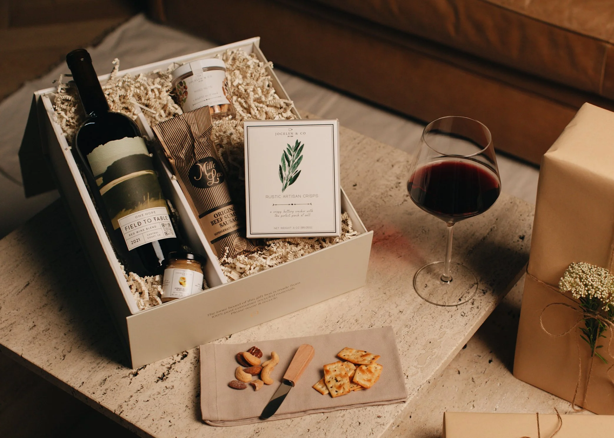
We transformed ONEHOPE’s photography from casual, stock-like in-home moments to a direction that blended luxury with community. The new approach featured upscale, editorial-style gatherings, consistent and elegant 3D-rendered product shots, and lifestyle imagery that captured authentic connection while elevating brand sophistication. This shift strengthened brand perception, positioning ONEHOPE as both a premium Napa winery and a community-driven brand with heart.
Before
After
We redesigned ONEHOPE’s print materials, transforming casual, sales-focused collateral into pieces that reflected the upscale Napa-inspired brand. Wine tasting guides became elegant and educational, event materials highlighted wine as central to meaningful gatherings, and seller tools shifted from “selling wine” to “hosting elevated experiences.” This overhaul elevated every customer touchpoint and gave sellers a brand identity they could proudly represent.
Before

After

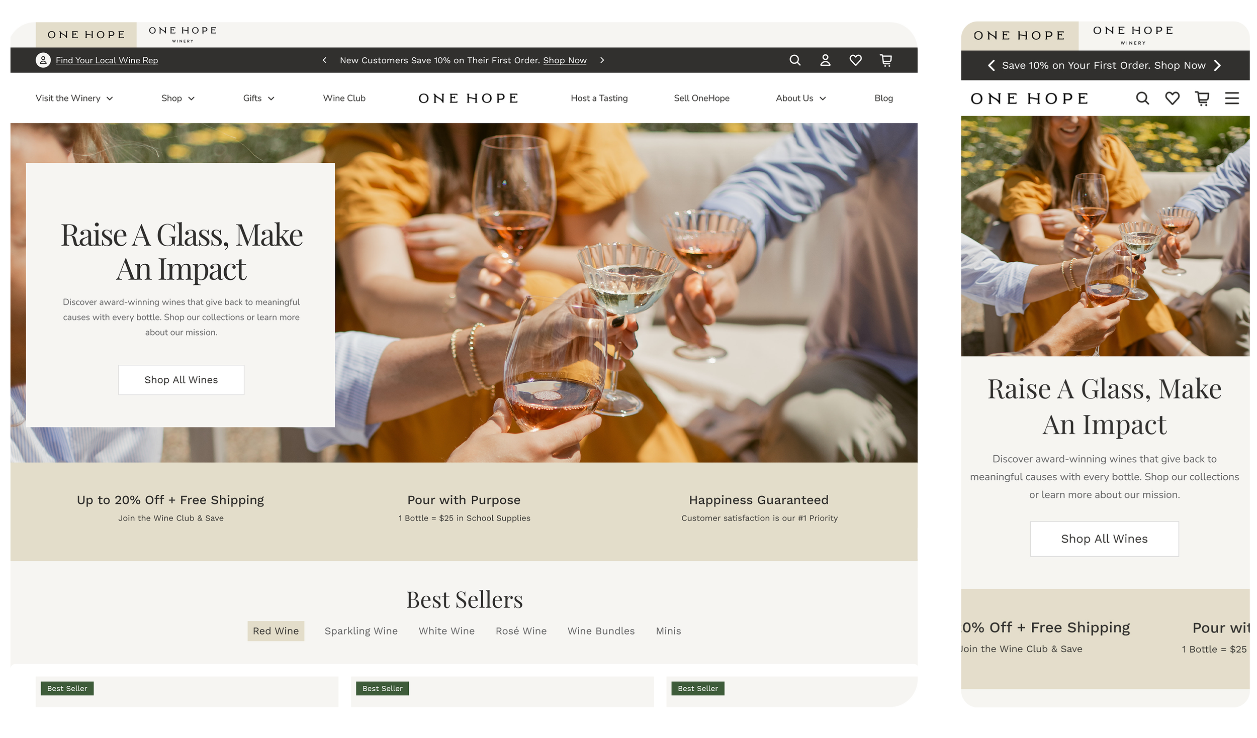
Web
The previous website relied heavily on lifestyle imagery and storytelling but lacked clear pathways for action. Calls-to-action were inconsistent and visually muted, product discovery lacked urgency or pricing transparency, and Wine Club benefits were hidden within a carousel that buried key value propositions, resulting in a disjointed, casual, and conversion-inefficient experience. We redesigned it into a modern, elegant, and high-converting site, featuring an upscale design system, consistent CTAs, shoppable 3D-rendered product pages with transparent pricing, and a restructured homepage that highlighted Wine Club perks, product features, and impact stories. By integrating emotional storytelling with clear conversion paths, the site now elevates the brand, communicates ONEHOPE’s mission, and functions as a powerful sales engine.
Before
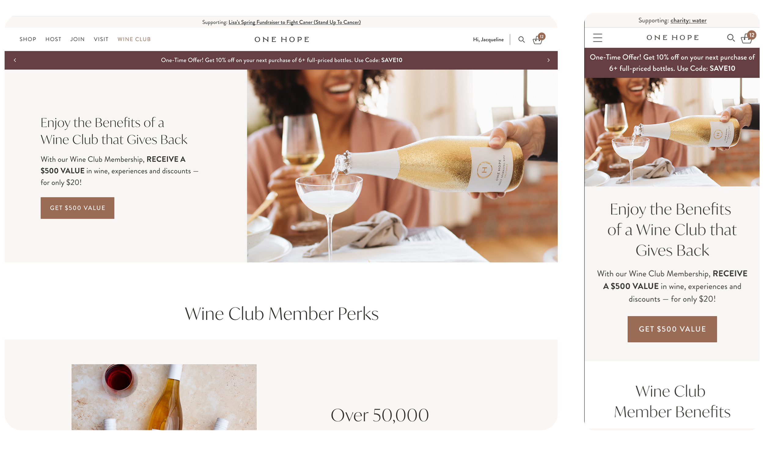
After
Brand Book
Comprehensive brand guide that establishes clarity and cohesion, introducing a refined Napa-inspired color palette, elegant and timeless typography, photography principles blending aspirational moments with approachable community gatherings, and messaging frameworks emphasizing quality, impact, and togetherness.

Website Replatform
We redesigned the website into a modern, elegant, and high-converting experience that balanced emotional storytelling with clear purchase pathways. Updates included an upscale design system, consistent CTAs, shoppable product pages with simplified 3D-rendered bottles, and a restructured homepage highlighting Wine Club perks, products, and impact stories—integrating ONEHOPE’s mission directly with sales and engagement.

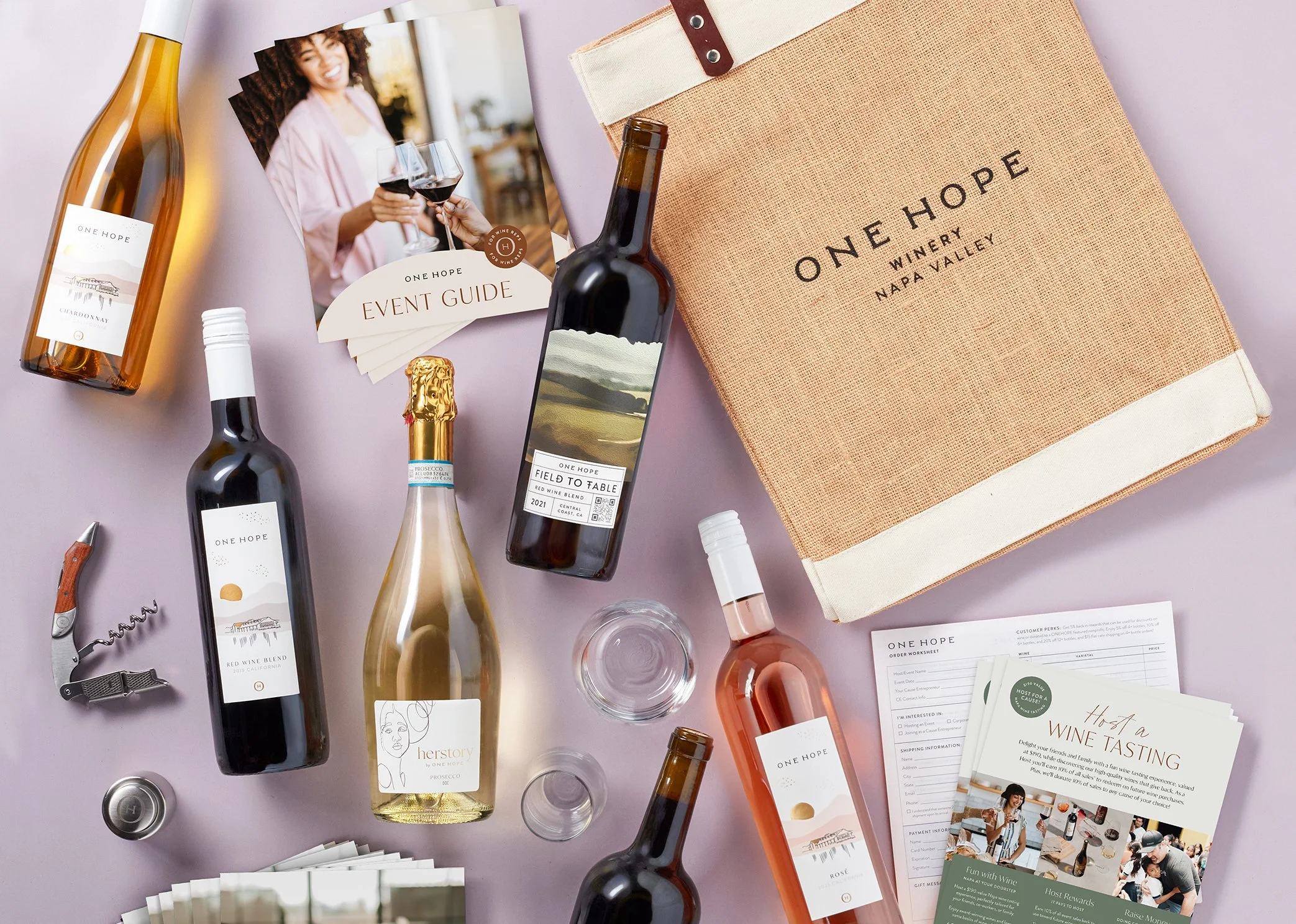
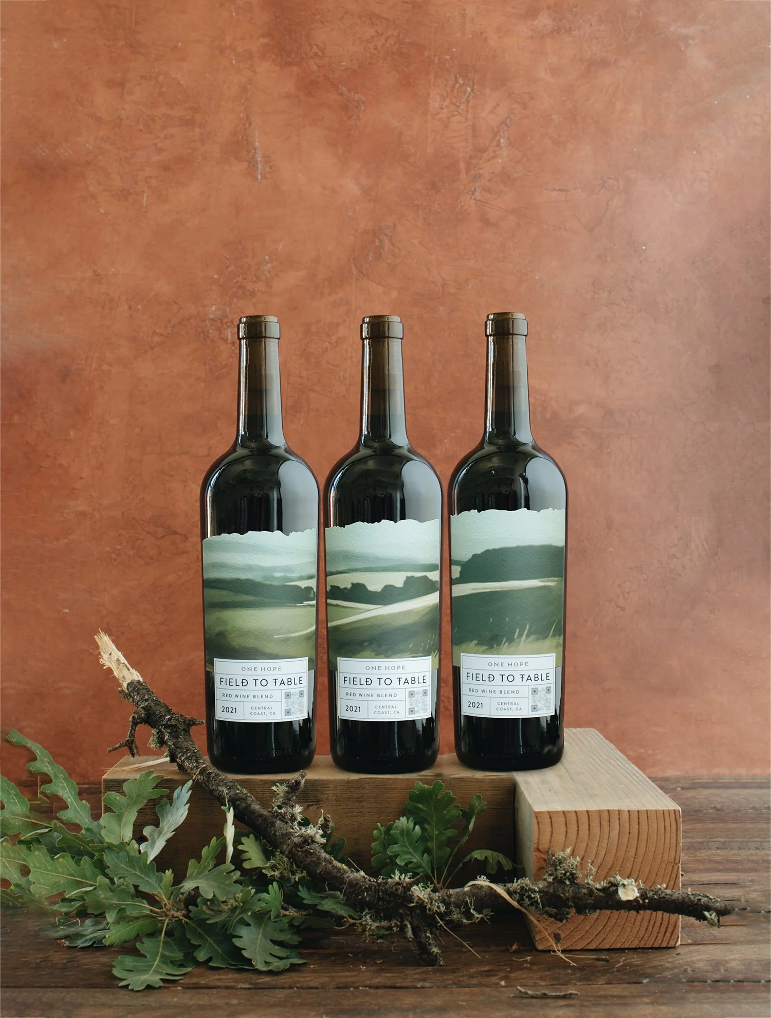
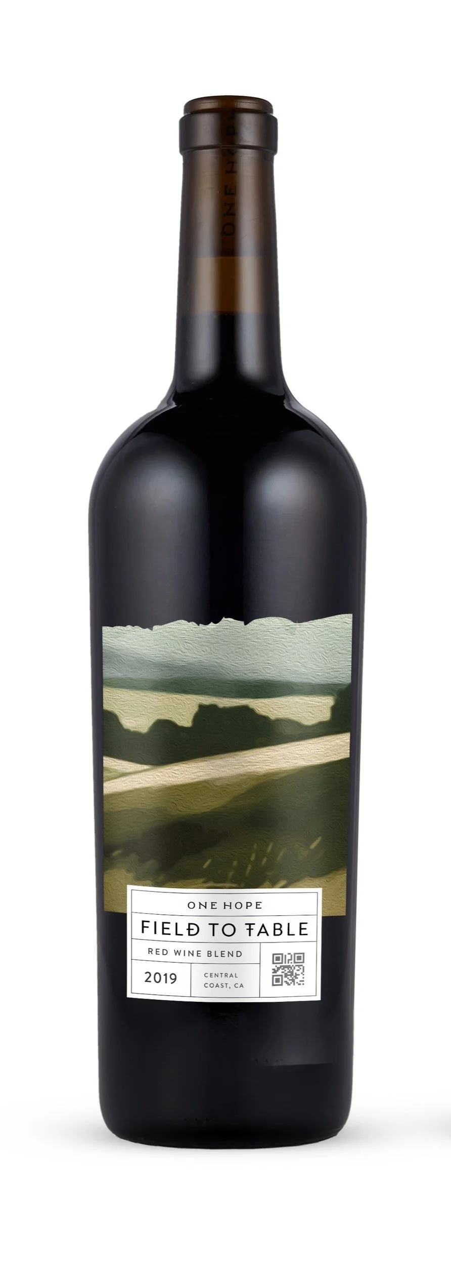
Packaging
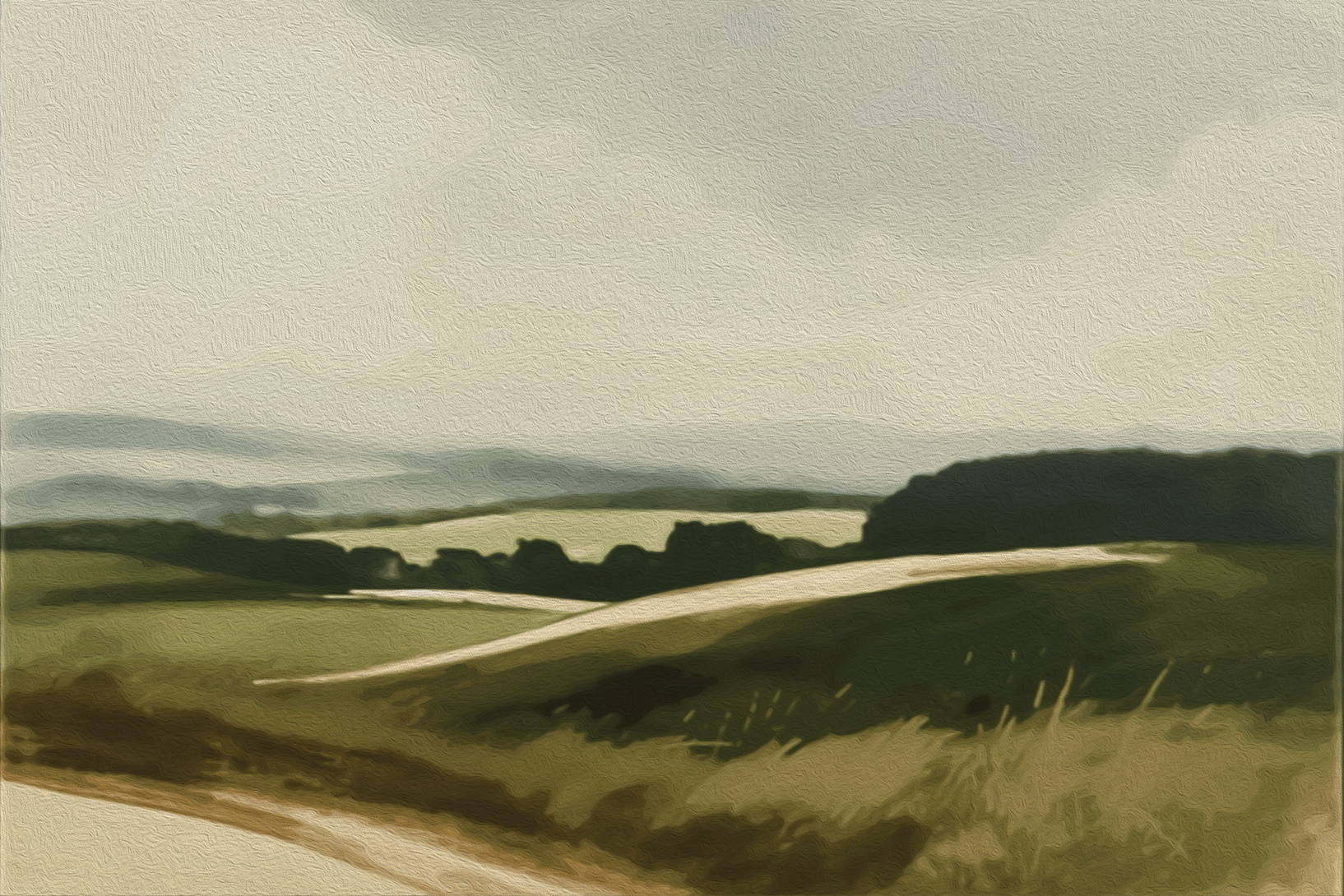
The Field to Table Red Blend 2021 introduced a first-of-its-kind collectible three-bottle label series for the brand, a concept I developed to elevate both the design and marketing strategy. Each label captures the Central Coast’s rolling hills and coastal landscapes through sophisticated paintings, a refined color palette, and thoughtful layout, creating a cohesive visual story across the set. Designed as a collectible series, this packaging encouraged customers to purchase all three bottles, successfully promoting sales while reinforcing the brand’s premium identity. This project highlights how strategic creative direction and innovative label design can turn packaging into a compelling, brand-defining experience.


Creative Direction:
Kristen Arimond
Art Direction:
Meg Robbins
Design:
Kristen Arimond
Photography:
Taylor Hotter
Meg Robins