POMIFERA
Packaging Creative Direction, Design & Execution
The Challenge
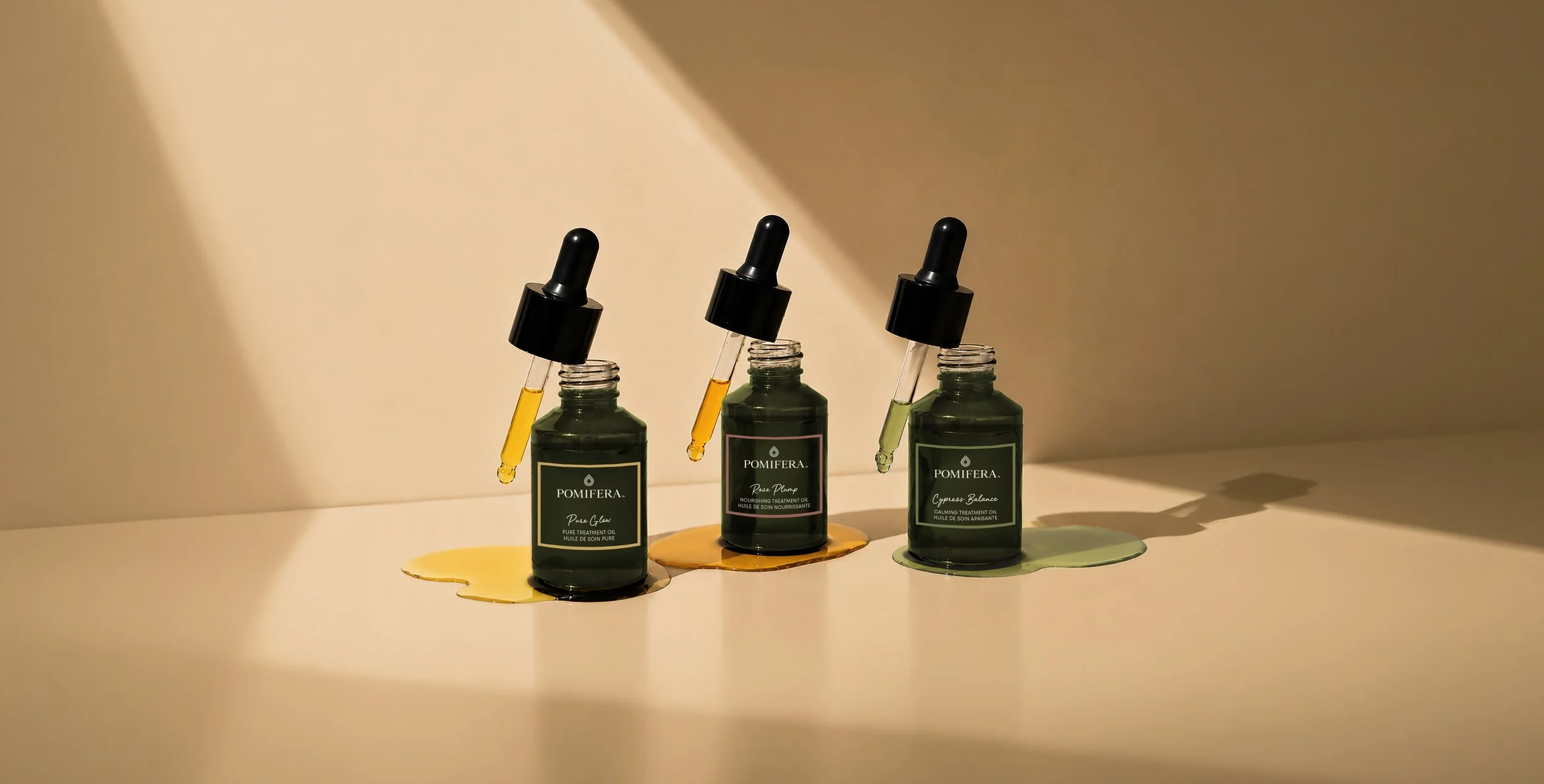
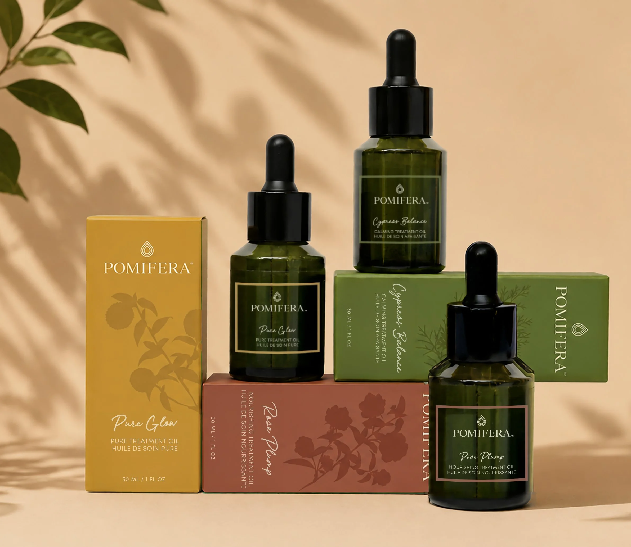
As Pomifera’s product line grew, its packaging evolved product by product, resulting in different design styles across the brand. The goal was to create a more cohesive, elevated aesthetic that strengthened brand recognition while giving individual collections room to have their own identity.
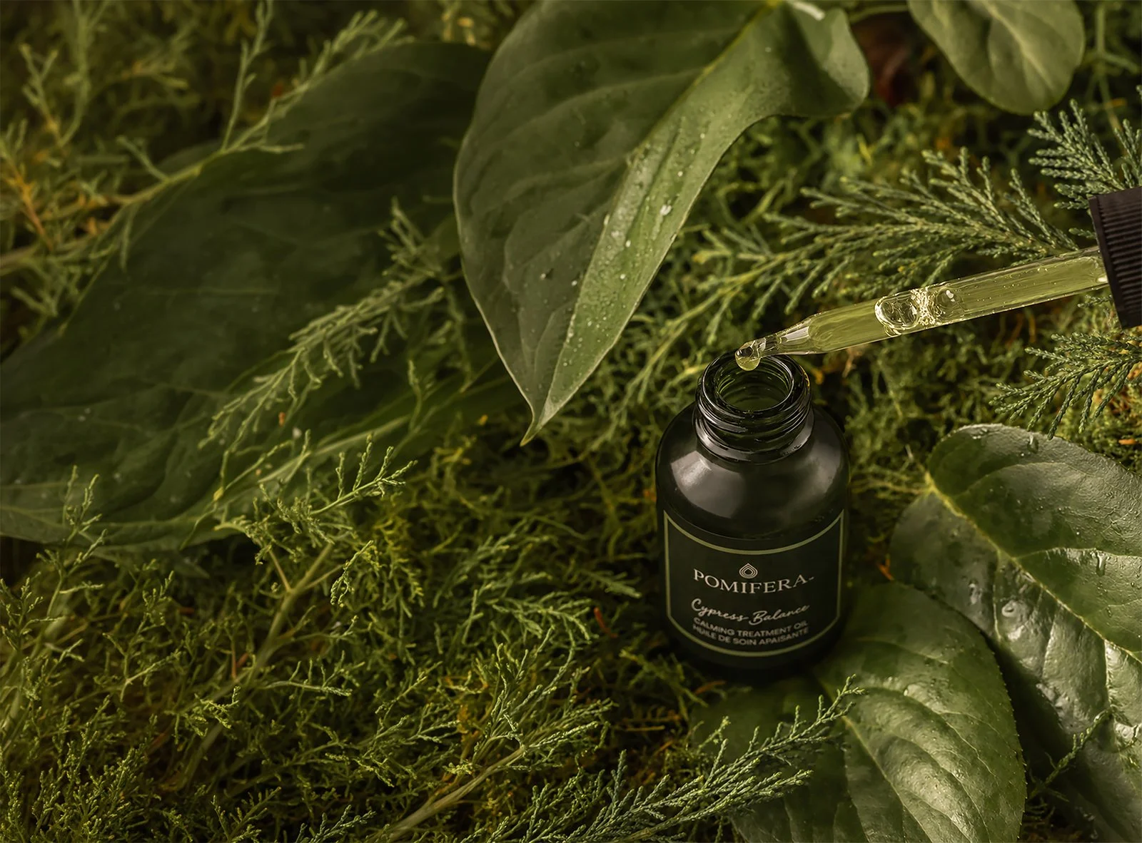
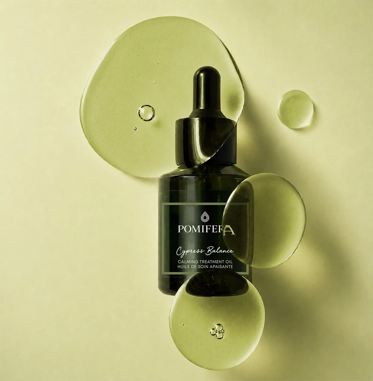
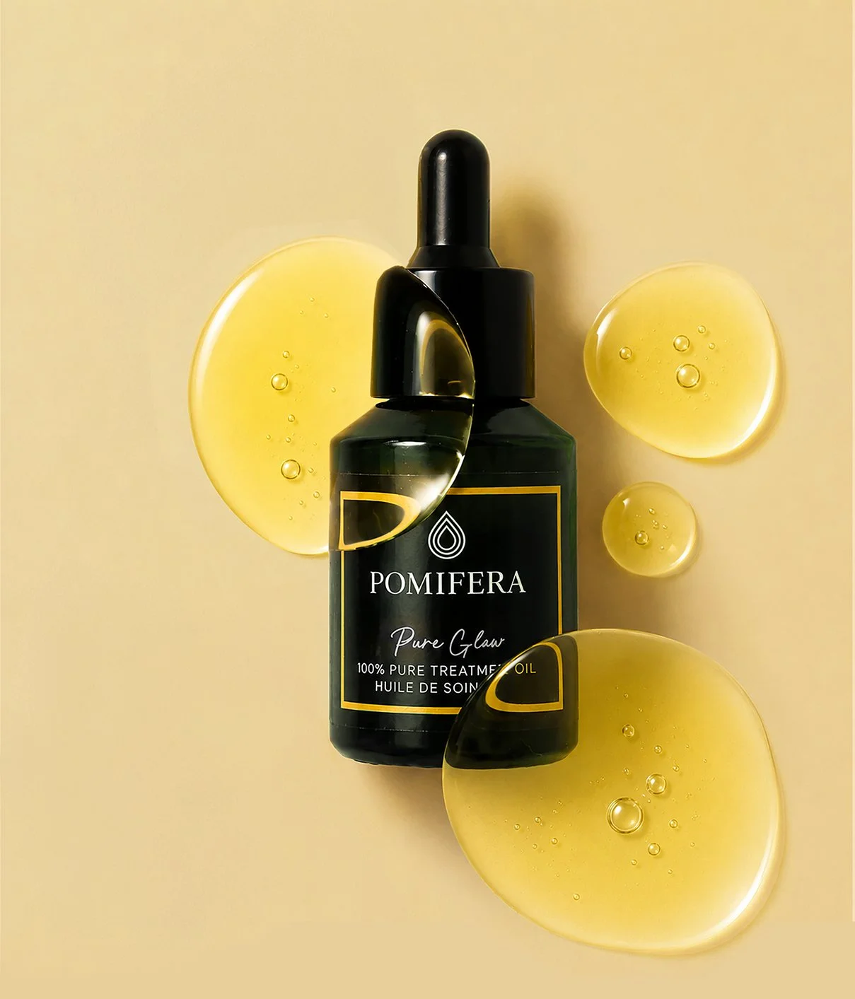
I led the redesign around a consistent system of typography, label structure, color and branding. For the Treatment Oils, three distinct colors differentiate Pure Glow, Rose Plump and Cypress Balance while creating a foundation for future skincare routines built around each oil.
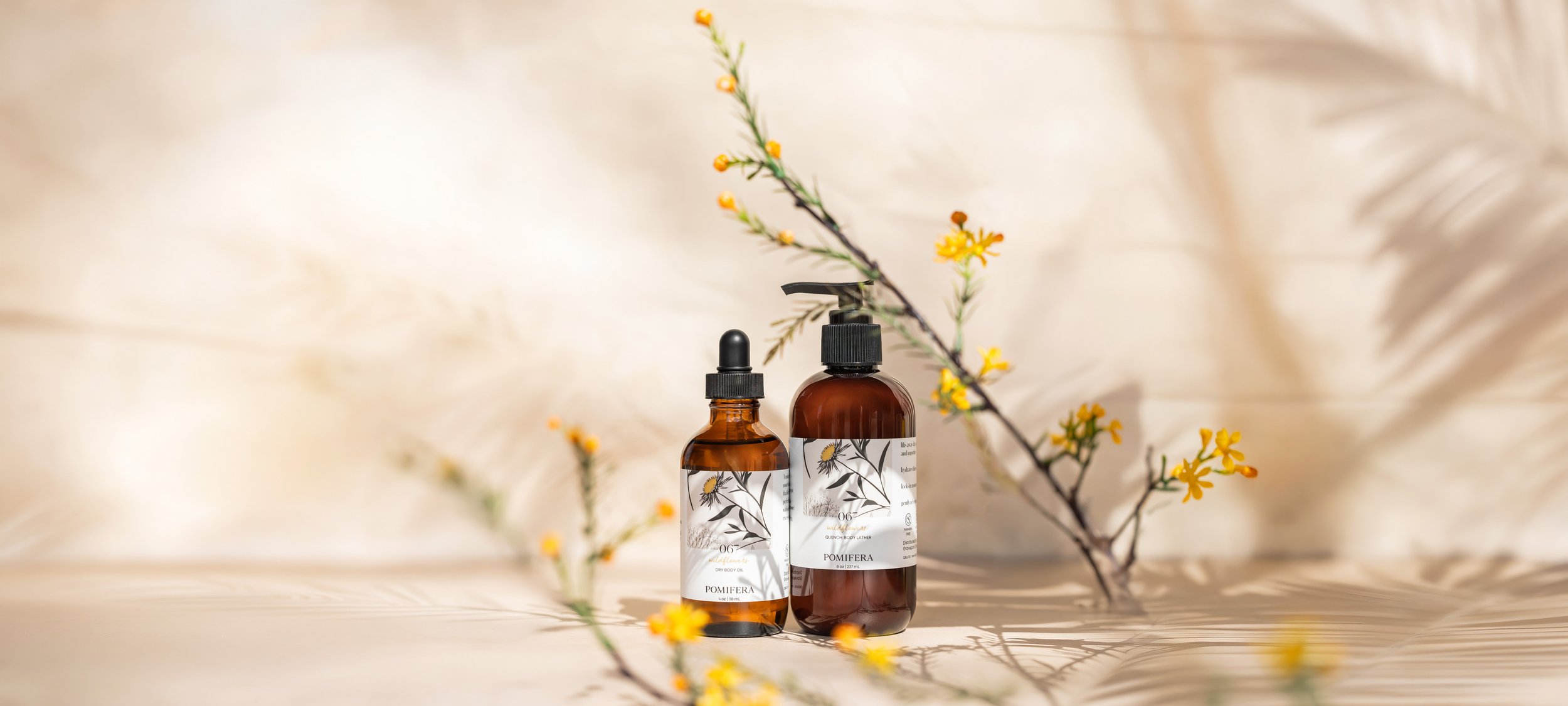
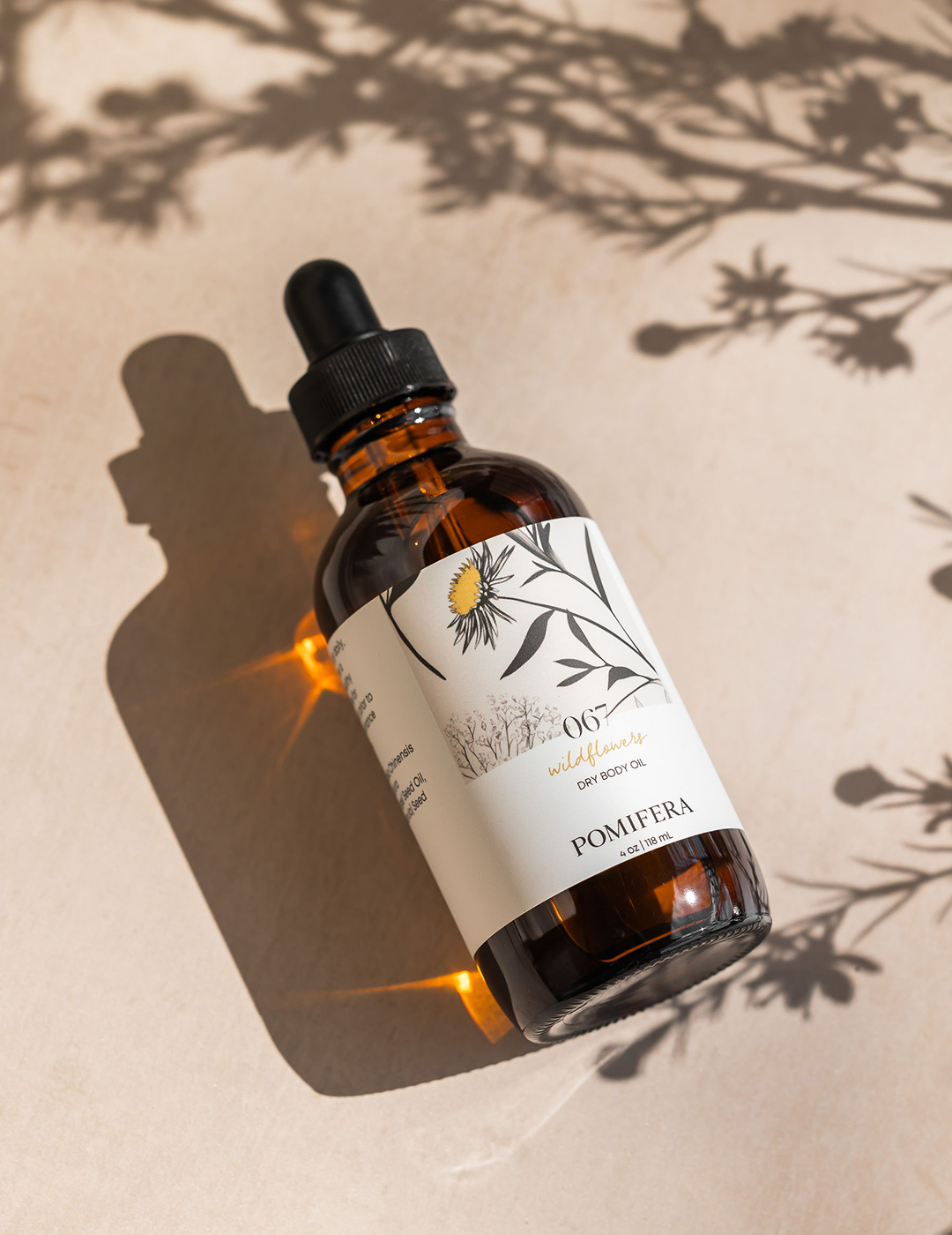
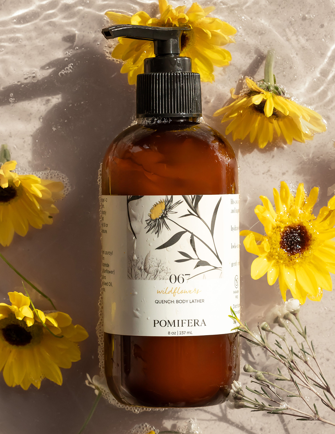
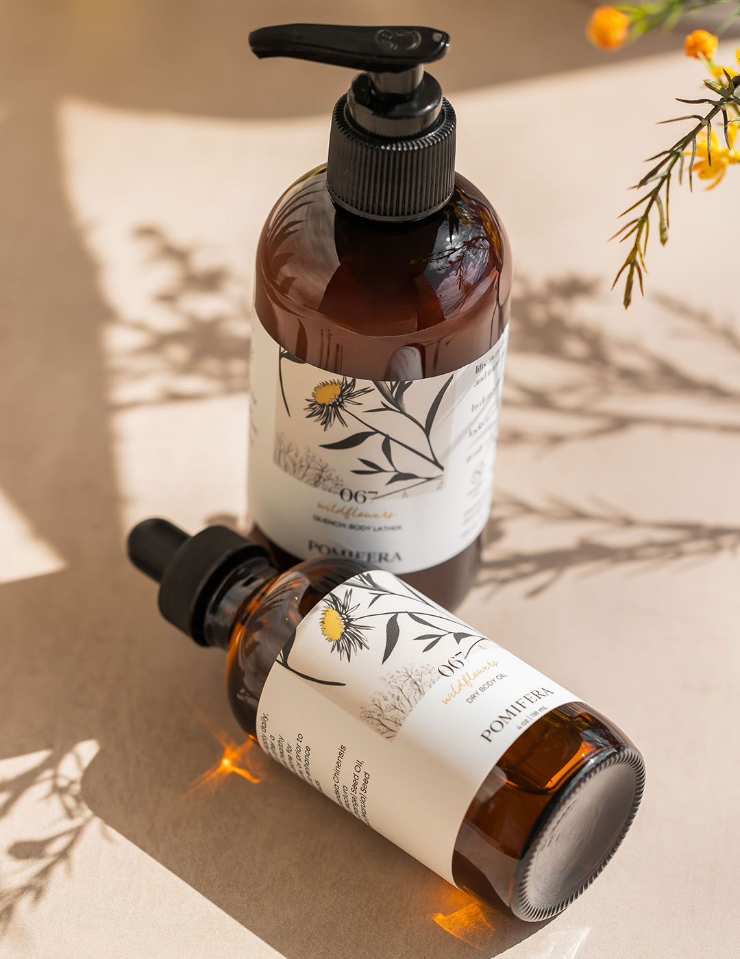
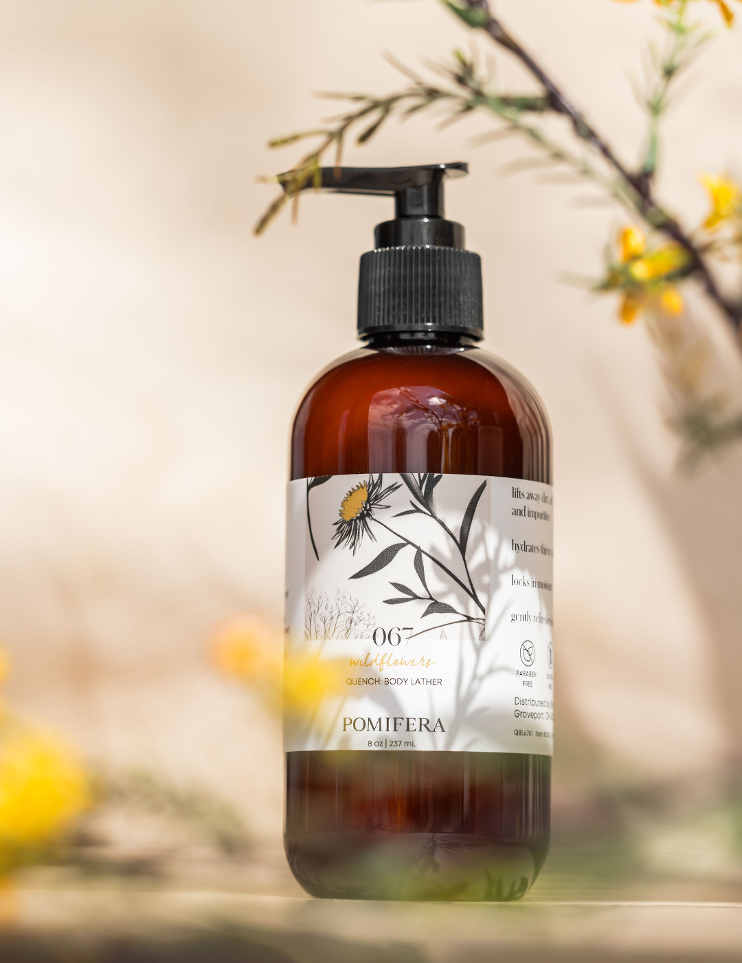
For the limited-edition Wildflowers collection, botanical artwork brought a more expressive, seasonal feel to the system while maintaining the same elevated Pomifera identity.
Execution
The Result
The redesign brought previously disconnected products together under one recognizable visual language. More than a packaging refresh, it created a scalable system that allows evergreen products to grow into larger families and limited-edition launches to feel unique without losing the connection to the brand.
Creative Direction:
Kristen Arimond
Design:
Kristen Arimond
Photography:
Kristen Arimond
Maleri Schilling